Rule of Thirds
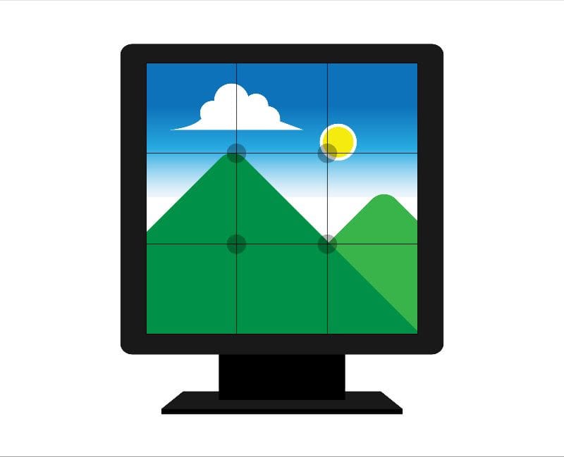
Why Some Designs Just Work: The Rule of Thirds Explained If you’ve ever looked at a photo, ad, post, or website and thought, “That just feels right,” there’s a good chance the rule of thirds was at work. This classic design principle shows up across graphic design, photography, social media, and UX design because it aligns with how people naturally scan and absorb visual information. The beauty of the rule of thirds is its simplicity. You don’t need advanced tools or design training to apply it well — just a basic understanding of how visual balance works. What Is the Rule of Thirds? Picture a layout divided into nine equal sections using two horizontal lines and two vertical lines. The rule of thirds suggests placing important elements along those lines or at their intersections instead of centering everything. This approach creates balance without symmetry. It gives designs a sense of movement and structure, helping the eye travel naturally from one element to the next. Graphic Design: Creating Clear Visual Hierarchy In graphic design, the rule of thirds helps establish order. Headlines, images, logos, and calls to action are easier to process when they’re given their own space. Placing a headline near the top third, a supporting image along one side, and key details near a lower intersection guides readers through the design without confusion. This is especially effective for ads, flyers, postcards, and email graphics, where space is limited and clarity matters. Photography: Making Images Feel Natural Photography is one of the most common places you’ll see the rule of thirds in action. Centered subjects can feel formal or static, while off-center placement adds interest and depth. Aligning a subject’s eyes with the top third or placing a horizon along the lower third creates a more dynamic image. This technique is widely used in lifestyle photography, product shots, and brand imagery because it feels authentic and approachable. Social Media Graphics: Stopping the Scroll On social media, the rule of thirds is especially powerful. Graphics that place text, faces, or focal points slightly off center tend to feel more modern and intentional. Leaving space in one third of the image for text while anchoring visuals in another keeps posts readable and visually appealing, especially on small screens. It also helps ensure that important elements aren’t covered by platform overlays or cropped in previews. UX Design: Supporting How People Navigate In UX design, the rule of thirds supports usability. Websites and landing pages that place key content along natural viewing paths are easier to scan and interact with. Users don’t read screens line by line — they scan. Aligning headlines, images, and buttons with the rule of thirds subtly guides attention and encourages action without overwhelming the viewer. Knowing When to Bend the Rule Experienced designers can break the rule of thirds because they understand why it works in the first place. When balance, hierarchy, and visual flow are intentional, stepping outside the rule can create emphasis or interest rather than confusion. Without that foundation, breaking it often feels accidental instead of purposeful. Why It Just Works Used thoughtfully, the rule of thirds brings clarity, balance, and ease to almost any visual, whether print or digital. By aligning layouts with the way people naturally scan and process information, it helps designs feel more intuitive, reduces visual strain, and makes key messages easier to notice without needing extra explanation.